Friday, 26 March 2010

Evaluation

As part of my AS Media Studies course i had to undergo two tasks which i would plan, research, and evaluate using my own blog as the electronic format i would showcase my portfolio of work. The brief of the task I had to undergo was to use the skills I had learnt in both photo shop and in the class. I would then use these skills for the preliminary task to create a front cover and a mock up of a contents page for a new college magazine. The main task i had to undergo and really test my skills on however was to create a front cover, contents pagedouble page spread of a new music magazine. I had to research the codes and conventions of already available music magazines and see how I could use them in my own magazine to make it look professional and then meet a deadline for when the work was in, in order to make my music magazine my own and not a replication of already on sale magazines I decided to develop and challenge the conventions of real media products. and

In what ways does your Media product use, develop or challenge forms and conventions of real Media products?

I feel that i designed my music magazine in a way in which it would use, develop and challenge forms and conventions of real media products. When i was first given this task, i did some research into already available music magazines and the codes and conventions they used. The research I did on music magazines all showed that they had a current running theme of red font; I decided to keep this colour in my own work as it is a vibrant colour which has many connotations such as danger, blood, violence as well as the more positive connotations of love and lust. I thought it would be a good idea to keep this theme as the target audience i aimed my magazine at was people aged between 16 and 24, the list of connotations of the colour red are all emotions or experiences the target audience of my magazine will experience throughout that period of time in their lives. Another convention i chose to follow on the front cover of my magazine was a short and snappy Masthead; following in the steps of music magazines such as “Q”. I chose to do this as a three letter masthead is much easier to remember rather than a longer name for my magazine also the magazines i researched into either had a one letter masthead or a longer word whereas “RBL” is three letters, it has no meaning to a generation other than my target audience and would stand out against already on market magazines.

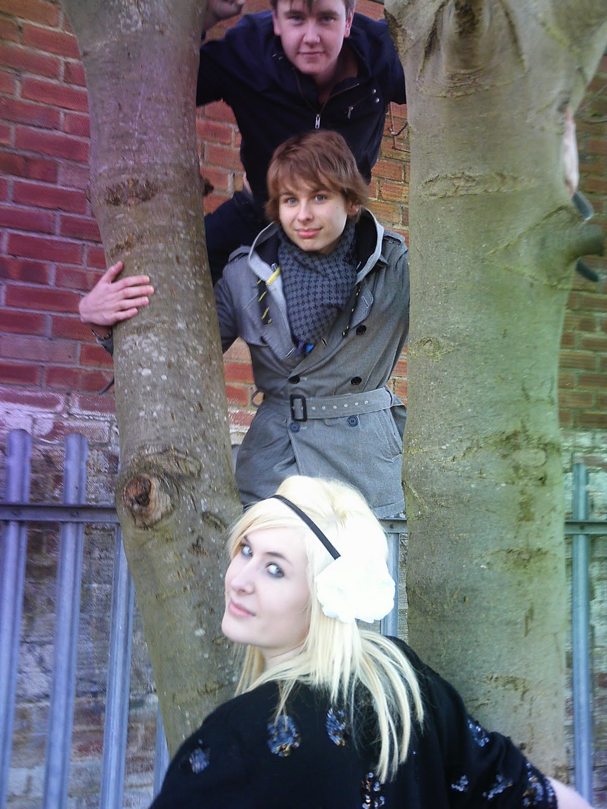
The majority of the magazines i researched into contained a plain background that remained out of focus sometimes just having a white background on the front page of their magazines. I decided that unlike most of these magazines I would like to include a background behind the main image of my front cover. This would enable my magazine to stand out against other magazines as well as adding affect to the representation i was trying to achieve. The background of my front cover entailed bricks and a grey fence which adds effect as it shows the photograph was taken in a rural area as well as the idea that the grey fence signifies entrapment and loss of freedom i.e a prison cell. I thought the prison cell connotation was good and matched the masthead (“RBL” which is an abbreviation for Rebel) of my magazine as well as appealing to the target age group.

The conventions I researched on music magazines all showed that they re-used the masthead from the front page in a smaller version throughout their magazine. I thought this was a really effective thing to do and an important connotation that i should reuse in my own magazine. The placement of the masthead on the front page of the magazine however i chose to break all of the conventions of a usual music magazine, I decided to place it straight in the centre of the page; by doing this the conventions that have been broken can be related to my target audience of 16-25 which is the period of time that people stereotypically go through a rebellious stage which is also where I got the “RBL” title from. I also feel that by placing it somewhere other than the top left hand corner it proves how unique my magazine is and that it isn’t just another clone of all the other magazines; i hope that this would tell the audience of my magazine that it would not just contain the same contents as the other magazines. Although the placement of the masthead could not be in the centre of the contents page and double page spread like how it was on the front cover as it would interrupt the main features that would be placed within the contents of those pages, I decided to follow the conventions of on sale music magazines and placed it in the left hand corner. I chose to keep all of the usual conventional features of a real media product in order to keep it looking like a real piece of media production for example the date, issue number and price however i just replaced them and moved them around to add more individuality, a word which every person within my target audience will be fighting for.

How does your Media product represent particular social groups?

I decided to make my media product represent different social groups which is why i decided to include advertisements of different genres of musicians on my front cover. The main colour running throughout my magazine also helps represents different social groups as red and black have connotations towards violence and danger; this side of the magazine represents the rebellious social groups who are trying to find themselves and sometimes going down the wrong paths which could also be related to some of the musicians that I have said feature on the inside such as Will.i.am who is from the hip-hop genre which has connotations to violence. The other side to the social groups my magazine represents is the more down to earth, laid back people. During the interview with my cover artists I made sure they came across very humble and polite. The clothes the male musicians i have pictures are wearing very laid back day to day casual wear which most youths would be wearing however the female musician is wearing a huge flower in her hair and a sparkly cardigan which also represents the idea of showing your emotions and who you are by how you dress. By the magazine representing a range of social groups it also attracts people from every cliché widening my market.

What kind of Media institution might distribute your Media product and why?

Media institutions such as Rolling Stone and Q would distribute my media product, as I feel it is attracting more of a younger audience, whereas media institutions such as Rolling Stone magazine seem to attract more of an older audience. I also feel institutions such as NME would benefit from distributing my magazines as NME magazine only seem to feature one genre which is indie-rock and therefore do not benefit from a varied type of audience which i feel my magazines “RBL” does.

Who would be the audience for your media product? How did you attract/address your audience?

Through researching different music magazines I have decided to aim my target audience at males and females aged between 16 and 24. I chose this age as some of the language which may be used in the magazine may be inappropriate for a younger age and people over the age of 24 who are maybe more settled and out of the whole student lifestyle by then may be uninterested as well as having a less disposable income. It was a lot easier to aim this as my target audience as music is a dominated thing in the lives of people between these ages.

I feel achieved an aim of attracting my audience I feel this as on the front page I managed to include both female and male artists which was important as I did not want to favour either sex so that my target audience was on the borderline. I feel that by widening my target audience it allows the magazine to be of a more interesting read for the readers. The main focus point of the front cover my magazine is the image which has been photographed at a direct mode of address, which is inviting and eye catching to the audience which allows the audience to connect with the artists emotionally as well as intellectually (by making the audience think of how they know the musicians and why they know them) before purchasing the magazine. The idea that the contents page image has the girl laughing shows that the musicians, don’t take themselves too seriously and are down to earth which also enforces the idea that the audience will have a connection with them.

What have you learnt about technologies from the process of constructing this product? Looking back at your preliminary task, what do you feel you have learnt in the progression from it to the full product?

The first new piece of technology that i learnt to use during this course was blogger. At first i found it extremely confusing however the more i used it and looked around the site i came to grips with it and now i find it fairly straightforward. My knowledge of photoshop editor has gone from having no clue what it was to a basic knowledge of how to work it. I believe i got the best out of the programme using the tools i knew how to use such as the Lasso tool. I am happy i chose to challenge myself by using Photoshop rather than Publisher as i believe although i had less knowledge of the tools i took complete advantage of the tools i was able to use and therefore my work benefitted from these. I also thought the use of having many layers is a great idea as it enable lots of ideas to be put into effect.

Looking back over the time i have spent on this portfolio of work i now realise that it takes alot of time and a lot of work to make a magazine and i honestly have no idea how people who do this as a profession have the time to get their magazine out in less than a week deadline. At the beginning of the task when i was undergoing the preliminary task i thought i was out of my depth doing this course as i had no skills whatsoever to make a magazine, however after learning to the different programmes such as blogger and Photoshop i believe i have done a good job. The research and planning part of the task i thought took a long time however i believe that without that part, my work would have suffered dramatically. Overall i now feel comfortable using the different programmes i would need to use to make a music magazine.

If i was to do this task again the only thing i would do differently would be to manage my time more realistically. Although i maintained during this task there are gaps within the dates that posts are posted onto my blog when i was designing the front cover, contents page and double page spread therefore my time management looks poorer than it should however i could have update my blog with the progress i was making.


Final 3 images


Front cover
Contents

Double Page Spread

Feedback

I created a questionnaire of 5 questions and handed it out to 10 people between the ages of 16-21.

Q1. What would make my product stand out on a shelf of other music magazines
- The background image 6 people
- The price is at the top of the page 2 people
- Colourful 1 person
- The sub-heading 1 person

Q2. What do you think the genre of my music magazine is?
- Versatile 2 people
- Indie 7 people
- Pop 1 person

Q3. Is the contents page easy to follow?
- Yes 10 people
- No 0

Q4. Do you think i should have included all of the contents of the magazine on the page?
- Yes 4 people
- No 6 people

Q5. Would you be likely to read the double page spread?
- Yes 7 people
- No 3 people

Thursday, 25 March 2010

Double Page Spread


This is the final double page spread; including columns, the continue to the next page and who the article was wrote by.


This double page spread before the final touches where put on.


This image was the first idea i came up with for the double page spread. My initial intention was to use three different images of the individual band members with a blue background however i decided to use a picture of the whole band together which overlapped onto the opposite page, this is more affective as it shows how dominant they are which is a point i was trying to put across to the audience. The dominance signifies how important they are in the music industry at the minute.
I.C.T Design of double page spread

Contents Page

Final Contents page

I.C.T Design of Contents

Monday, 11 January 2010

Final Front Cover

FINAL FRONT COVER

Masthead, price, bar code, date, issue heading and sub-heading


Masthead placement
Background image

This front cover had the conventions i wanted to show however i changed parts of it as it needed some improvements.


I.C.T Design of Front cover


Friday, 18 December 2009

Photographs


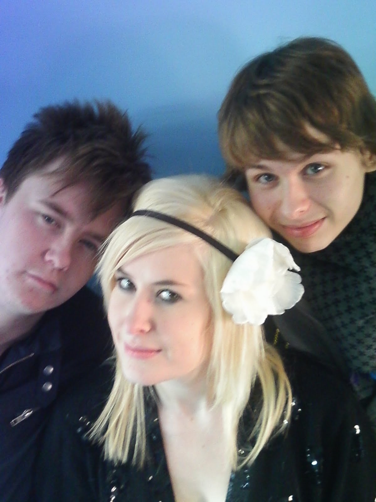
I asked three of my friends 2 boys and one girl to be models for my pictures. I chose these three as the boys have a similiar liad back style whilst the girl had a sequined jacket and more of edgeyness to her. I asked the boys to dress how they normally would but asked the girl to wear the flower headband and the sequined jacket which contrast with one another. I chose to do a range of shots with different poses, angles and lengths as i new i needed to get as many as possible in order to get a good choice to choose from.

Thursday, 17 December 2009

Target Audience

Through researching different music magazines i have decided to aim my target audience at 16-24. I chose this age as some of the language which may be used in the magazine may be unappropriate for a younger age and people over the age of 24 who are maybe more settledand out of the whole student lifestyle by then may be uninterested. It will be alot easier to aim this as my target audience as music is a dominated thing in the lives of people between these ages.
To ensure that i will aim the magazine at my target audience i will make sure i give them what they want. I will make the magazine looks young and fresh but also to fit in with my genre of indie/rock. I want my magazine to stand out apart from others which is one of the main reasons of the brand name "RBL".

Moodboard


Conventions Of My Music Magazine

After researching various music magazines aswell as fashion/celebrity magazines i have plenty of ideas how i would like my magazine to look and the conventions i would like to include within my own piece of work.

Front Cover;
The main part of a front cover is the image which will feature, all of the characters used i will ensure they are facing the camera which is a continuous theme which i have found within my research. I have also chosen to use a band as the main image rather than a single artist which is what the target audience of my magazine i believe would prefer. I have decided that unlike most magazines i would like to include a background behind the image instead of the magazines i have researched which usually keep it white.
The masthead of my magazine i have decided to follow the continuous trend of other magazines and keep it short, in capitals and red. Red is a very strong, bold colour which has many connotations to anger, violence, blood but also love and passion by the contrast in connotations this could represent how versatile the contents of my magazine is. Although i have followed the conventions of other magazines when referring to the font and style of my masthead i have changed the position. Instead of placing the masthead in the top lefthand corner of the screen i have chosen to put it straight bang in the centre of the front page. By placing it in the middle of the page this signifies domination which is exactly the message i wanted to connotate. The only problem i have recognised with placing my masthead in that position is if my magazine was placed behind other magazines on a shelf, the masthead would not be recognisable.
The characters are all placed ontop of eachother in the centre of the page, two of which are seperated by the masthead, the bottom of the page below one of the characters heads also features a heading which is the name of the band "Cursed Glitter" I chose the name as it is an antagonistic phrase with cursed having no connotations to the word glitter and vice versa. Above the heading which i used Dafonts.com to write is the subheading. The subheading is a quote taken from the interview which is included inside of the magazine.
Down the side of the cover i decided to list the names of some of the artists which feature inside the magazine, instead of the normal conventions which would place the plug at the bottom of the page along the bottom; again i have chosen to break the conventions.
The placing of the barcode, date and issue which have been placed in the top left hand corner are also other examples of how i have broken the usual conventions of a music magazine.

Contents Page;
I started off with re-using the masthead from the front cover as in my research of other music magazines i also realised they did. Although the placement of the masthead could not be in the centre of the page like how it was on the front cover i decided to follow the conventions of on sale music magazines and placed it in the left hand corner.
The heading of the contents page i decided to just use "Contents" this informs my audience what the page is aswell as fitting perfectly overlapping the masthead. The research i did showed that this broke the usual conventions of placement of header as it was usually at the side of the masthead o beneath it. Underneath the heading i used an image of the band which feature on the front page of my magazine this shows that it wasn't just a random act them being on the front and they feature all the way through the magazine. Both the two boys which feature on the outsides are loking towards the camera smiling which shows they are welcoming and not intimidating in any way. The girl which is seated in the middle of the two boys is laughing showing she is carefree and signifies that she doesnt really care of what she looks like to other people as she is confident in herself.
Beside the image is the editors note, i chose to include this as every magazine i researched had one, to keep it personal as a note from the editor to the individual reader i chose to wish them a happy new year which gives off a friendly view. Although i chose not to use an image of myself i did use a signature like font to sign my own name.
The research i did into magazines i found the majority had catagorised the contents of their magazines into features- things that may "feature" on the cover of the magazine aswell as being exclusives that you would not find usually inside, the other catagory "every month" which catagorises the contents of the magazine you could find inside every issue. I decided to follow this convention however usually in magazines a contents page lists the majority of the contents which can be found inside the magazine however a few of the magazines i researched had double contents pages so i decided i would put the top articles under both catagories on this page as it would be the first page the audience would see and list the rest of the contents on another page however i only designed the one page contents page.
I decided to keep the red colour scheme all the way through my magazine so i used it as the font colour for the names of the two catagories aswell as the numbers.
The page numbers i decided to make extra big in order to make them stand out, the bold red colour also contrasts with the black writing.

Double Page Spread;
I played around with the double page spread for a while branching out on different ideas but in the end i decided to go for a simple picture of all three characters and overlap it onto the other page. I did this so that the image dominated the article and therefore signifies the characteristics of the band and how well they are doing in the charts at the moment. Most images in magazines are of the people facing towards the camera, i decided to break the conventions and have them facing away looking towards where the sun is shining from, this could signify them looking towards the future.
I also decided to reincorporate the colour red so i used it for the headline "Exclusive", the page number and the name of the person who was speaking therefore all of these things would clearly stand out from everything else.
The masthead which i am using all the way through my magazine has also been placed in the top left hand side of the page.
I used the same font for name of the band "Cursed Glitter" on the double page spread as i did on the front cover and therfore could be seen as the same font on their merchandise. Instead of placing it straight across the page i decided to break the conventions and turn it on a 90 degree angle so it was down the side of the page. I find this really effective as it stands out against the colours in the image aswell as facing the way the characters are.
I decided to use columns to write the interview in as it fitted more of the interview in and it looks more professional.

Tuesday, 15 December 2009

Planning My Masthead

I came up with various ideas i could use for the title of the mashead of my magazine which included; Lyric, Melody, Cleff (asin the music note), Note, Harmony and mix. I came up with these words by researching musical terminology phrases.

I then decided that i wanted something more original so started to think of words which connotated with the indie/ rock genre of my magazine which is when i thought of the idea that stars which were already related to this genre of music have reputations for being rebellious. I toyed with the idea of calling my magazine Rebel, Rebellion and rebellious however i wasn't satisfied with having a long name for my magazine and i like the idea of having an abbreviated word or just one letter as the title for my music magazine. In the end i decided to shorten the word rebel and came up with "RBL".

I decided then to research different fonts and styles which i could use for my masthead. I used the website http://www.dafont.com/ to research this and chose a selection of my favourite styles which i could choose between.


Prices

Music;
NME-£2.30
Q- £3.90
Kerrang- £2.20
MOJO- £4.50

Fashion/Celebrity;
More!- £1.40

Researching Mastheads

I researched into different mastheads of various genred magazines to help find a style in which i could base my ideas on for my own masthead. I decided that the recurring pattern of the red bold font was a good idea to use however the only thig with this would be that there are already alot of magazines with a red masthead. So i would have to do something different with the style.
I then decided i could use the style that the "kerrang!" masthead has used, it looks very different compared to all of the other mastheads i have seen and also fits perfectly with the genre of its target audience, aswell as i my own. I have also decided that my font will be very bold.


2 More Textual Analysis Of Double Page Spreads

This double page spread very clearly states who this article is about not only by the large clear white font "Noel Gallagher" but also by the left handside page being dominated by a medium shot of the star with his head tilted downwards glancing up, this is done to make Noel look intimidating. Instead of a smile he shows no other facial expressions only those used by his eyes and the tilt of his head. Because the image was taken from a low angle it looks asthough his head is larger and closer to the lens than anyother part of him, this may correspond with the related stigma attatched to Noel as being arrogant or it could be to make him seem like somebody not to be messed with, he is of higher superiority. This can also be backed up by the slightly smaller less bold black writing underneath the stars name saying "The Chief". This term is usually used when talking about somebody of higher authority than everybody else and Noel gives of the impression he feels he is.
Noel is wearing a brown leather jacket which his hands are placed in, this also helps reflect these ideas as he is not giving off the impression he is a trustworthy boy next door who you oculd take home to meet the parents for example. The white aura behind the stencil shape of his body is white which fades into the light blue background colour, this shows connotations of angels and fluffy white clouds in the sky which all have positive connotations how ever the way Noel is positioned is quite the opposite. People are said to also have auras around them when are of higher superiority asthough they are untouchable and unstoppable which may be the representative the magazine is trying to achieve.
The page is spread out so that on the left hand side is the image and the right handside is all of the writing. At the top of the right hand page in the centre is a black box which includes the word "icon" the magaine this aricle featured in was doing a special edition of the iconic artists and bands which is why this was included so the audience could tell it belonged to other pages which where part of this article.
Underneath this is the artists name which is in the largest font, it is also white font which stands out against all of the res tof the font which is black. Underneath this is a heading " The Chief" this font is slightly smaller and then there is a sub-heading underneath this which is slightly smaller font again.
Underneath all of this are 3 columns of black text all of the same size and neatly set out. The whole layout of this spread is very clear and accurate.
The first word of the text in the first of the three columns begins with the capital letter "N" which is of the same size font of the heading, this could be because the artists name starts with the same letter or to emphasise that this is where the article begins.


This double page spread is unlike a normal interview it is questions from the readers that have been paid to ask the famous musician P!NK questions they would like to know about her music or personal life and recieve money in return. This is a great idea as it gets the reader more involved in the magazine and other readers who may have the same questions they would like to know may read the article in order to get these questins answered. The right hand side of the feature has a close up image of P!NK which would catch the readers attention automatically as in the picture she has a huge warm welcoming smile.
At the top left handside of the pages is a black thick line which goes along the page until halfway through the other page this is just clarifying that this is a main feautured article and will have been advertised on the front cover of the magazine.
The laft handside page which is where the text is is white in colour with 3 columns of black writing halfway down the page after more text including the artists name and what the article is "cash for questions" have been determined in a more spaced out slightly larger font.