Friday, 18 December 2009

Photographs


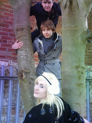
I asked three of my friends 2 boys and one girl to be models for my pictures. I chose these three as the boys have a similiar liad back style whilst the girl had a sequined jacket and more of edgeyness to her. I asked the boys to dress how they normally would but asked the girl to wear the flower headband and the sequined jacket which contrast with one another. I chose to do a range of shots with different poses, angles and lengths as i new i needed to get as many as possible in order to get a good choice to choose from.

Thursday, 17 December 2009

Target Audience

Through researching different music magazines i have decided to aim my target audience at 16-24. I chose this age as some of the language which may be used in the magazine may be unappropriate for a younger age and people over the age of 24 who are maybe more settledand out of the whole student lifestyle by then may be uninterested. It will be alot easier to aim this as my target audience as music is a dominated thing in the lives of people between these ages.
To ensure that i will aim the magazine at my target audience i will make sure i give them what they want. I will make the magazine looks young and fresh but also to fit in with my genre of indie/rock. I want my magazine to stand out apart from others which is one of the main reasons of the brand name "RBL".

Moodboard


Conventions Of My Music Magazine

After researching various music magazines aswell as fashion/celebrity magazines i have plenty of ideas how i would like my magazine to look and the conventions i would like to include within my own piece of work.

Front Cover;
The main part of a front cover is the image which will feature, all of the characters used i will ensure they are facing the camera which is a continuous theme which i have found within my research. I have also chosen to use a band as the main image rather than a single artist which is what the target audience of my magazine i believe would prefer. I have decided that unlike most magazines i would like to include a background behind the image instead of the magazines i have researched which usually keep it white.
The masthead of my magazine i have decided to follow the continuous trend of other magazines and keep it short, in capitals and red. Red is a very strong, bold colour which has many connotations to anger, violence, blood but also love and passion by the contrast in connotations this could represent how versatile the contents of my magazine is. Although i have followed the conventions of other magazines when referring to the font and style of my masthead i have changed the position. Instead of placing the masthead in the top lefthand corner of the screen i have chosen to put it straight bang in the centre of the front page. By placing it in the middle of the page this signifies domination which is exactly the message i wanted to connotate. The only problem i have recognised with placing my masthead in that position is if my magazine was placed behind other magazines on a shelf, the masthead would not be recognisable.
The characters are all placed ontop of eachother in the centre of the page, two of which are seperated by the masthead, the bottom of the page below one of the characters heads also features a heading which is the name of the band "Cursed Glitter" I chose the name as it is an antagonistic phrase with cursed having no connotations to the word glitter and vice versa. Above the heading which i used Dafonts.com to write is the subheading. The subheading is a quote taken from the interview which is included inside of the magazine.
Down the side of the cover i decided to list the names of some of the artists which feature inside the magazine, instead of the normal conventions which would place the plug at the bottom of the page along the bottom; again i have chosen to break the conventions.
The placing of the barcode, date and issue which have been placed in the top left hand corner are also other examples of how i have broken the usual conventions of a music magazine.

Contents Page;
I started off with re-using the masthead from the front cover as in my research of other music magazines i also realised they did. Although the placement of the masthead could not be in the centre of the page like how it was on the front cover i decided to follow the conventions of on sale music magazines and placed it in the left hand corner.
The heading of the contents page i decided to just use "Contents" this informs my audience what the page is aswell as fitting perfectly overlapping the masthead. The research i did showed that this broke the usual conventions of placement of header as it was usually at the side of the masthead o beneath it. Underneath the heading i used an image of the band which feature on the front page of my magazine this shows that it wasn't just a random act them being on the front and they feature all the way through the magazine. Both the two boys which feature on the outsides are loking towards the camera smiling which shows they are welcoming and not intimidating in any way. The girl which is seated in the middle of the two boys is laughing showing she is carefree and signifies that she doesnt really care of what she looks like to other people as she is confident in herself.
Beside the image is the editors note, i chose to include this as every magazine i researched had one, to keep it personal as a note from the editor to the individual reader i chose to wish them a happy new year which gives off a friendly view. Although i chose not to use an image of myself i did use a signature like font to sign my own name.
The research i did into magazines i found the majority had catagorised the contents of their magazines into features- things that may "feature" on the cover of the magazine aswell as being exclusives that you would not find usually inside, the other catagory "every month" which catagorises the contents of the magazine you could find inside every issue. I decided to follow this convention however usually in magazines a contents page lists the majority of the contents which can be found inside the magazine however a few of the magazines i researched had double contents pages so i decided i would put the top articles under both catagories on this page as it would be the first page the audience would see and list the rest of the contents on another page however i only designed the one page contents page.
I decided to keep the red colour scheme all the way through my magazine so i used it as the font colour for the names of the two catagories aswell as the numbers.
The page numbers i decided to make extra big in order to make them stand out, the bold red colour also contrasts with the black writing.

Double Page Spread;
I played around with the double page spread for a while branching out on different ideas but in the end i decided to go for a simple picture of all three characters and overlap it onto the other page. I did this so that the image dominated the article and therefore signifies the characteristics of the band and how well they are doing in the charts at the moment. Most images in magazines are of the people facing towards the camera, i decided to break the conventions and have them facing away looking towards where the sun is shining from, this could signify them looking towards the future.
I also decided to reincorporate the colour red so i used it for the headline "Exclusive", the page number and the name of the person who was speaking therefore all of these things would clearly stand out from everything else.
The masthead which i am using all the way through my magazine has also been placed in the top left hand side of the page.
I used the same font for name of the band "Cursed Glitter" on the double page spread as i did on the front cover and therfore could be seen as the same font on their merchandise. Instead of placing it straight across the page i decided to break the conventions and turn it on a 90 degree angle so it was down the side of the page. I find this really effective as it stands out against the colours in the image aswell as facing the way the characters are.
I decided to use columns to write the interview in as it fitted more of the interview in and it looks more professional.

Tuesday, 15 December 2009

Planning My Masthead

I came up with various ideas i could use for the title of the mashead of my magazine which included; Lyric, Melody, Cleff (asin the music note), Note, Harmony and mix. I came up with these words by researching musical terminology phrases.

I then decided that i wanted something more original so started to think of words which connotated with the indie/ rock genre of my magazine which is when i thought of the idea that stars which were already related to this genre of music have reputations for being rebellious. I toyed with the idea of calling my magazine Rebel, Rebellion and rebellious however i wasn't satisfied with having a long name for my magazine and i like the idea of having an abbreviated word or just one letter as the title for my music magazine. In the end i decided to shorten the word rebel and came up with "RBL".

I decided then to research different fonts and styles which i could use for my masthead. I used the website http://www.dafont.com/ to research this and chose a selection of my favourite styles which i could choose between.


Prices

Music;
NME-£2.30
Q- £3.90
Kerrang- £2.20
MOJO- £4.50

Fashion/Celebrity;
More!- £1.40

Researching Mastheads

I researched into different mastheads of various genred magazines to help find a style in which i could base my ideas on for my own masthead. I decided that the recurring pattern of the red bold font was a good idea to use however the only thig with this would be that there are already alot of magazines with a red masthead. So i would have to do something different with the style.
I then decided i could use the style that the "kerrang!" masthead has used, it looks very different compared to all of the other mastheads i have seen and also fits perfectly with the genre of its target audience, aswell as i my own. I have also decided that my font will be very bold.


2 More Textual Analysis Of Double Page Spreads

This double page spread very clearly states who this article is about not only by the large clear white font "Noel Gallagher" but also by the left handside page being dominated by a medium shot of the star with his head tilted downwards glancing up, this is done to make Noel look intimidating. Instead of a smile he shows no other facial expressions only those used by his eyes and the tilt of his head. Because the image was taken from a low angle it looks asthough his head is larger and closer to the lens than anyother part of him, this may correspond with the related stigma attatched to Noel as being arrogant or it could be to make him seem like somebody not to be messed with, he is of higher superiority. This can also be backed up by the slightly smaller less bold black writing underneath the stars name saying "The Chief". This term is usually used when talking about somebody of higher authority than everybody else and Noel gives of the impression he feels he is.
Noel is wearing a brown leather jacket which his hands are placed in, this also helps reflect these ideas as he is not giving off the impression he is a trustworthy boy next door who you oculd take home to meet the parents for example. The white aura behind the stencil shape of his body is white which fades into the light blue background colour, this shows connotations of angels and fluffy white clouds in the sky which all have positive connotations how ever the way Noel is positioned is quite the opposite. People are said to also have auras around them when are of higher superiority asthough they are untouchable and unstoppable which may be the representative the magazine is trying to achieve.
The page is spread out so that on the left hand side is the image and the right handside is all of the writing. At the top of the right hand page in the centre is a black box which includes the word "icon" the magaine this aricle featured in was doing a special edition of the iconic artists and bands which is why this was included so the audience could tell it belonged to other pages which where part of this article.
Underneath this is the artists name which is in the largest font, it is also white font which stands out against all of the res tof the font which is black. Underneath this is a heading " The Chief" this font is slightly smaller and then there is a sub-heading underneath this which is slightly smaller font again.
Underneath all of this are 3 columns of black text all of the same size and neatly set out. The whole layout of this spread is very clear and accurate.
The first word of the text in the first of the three columns begins with the capital letter "N" which is of the same size font of the heading, this could be because the artists name starts with the same letter or to emphasise that this is where the article begins.


This double page spread is unlike a normal interview it is questions from the readers that have been paid to ask the famous musician P!NK questions they would like to know about her music or personal life and recieve money in return. This is a great idea as it gets the reader more involved in the magazine and other readers who may have the same questions they would like to know may read the article in order to get these questins answered. The right hand side of the feature has a close up image of P!NK which would catch the readers attention automatically as in the picture she has a huge warm welcoming smile.
At the top left handside of the pages is a black thick line which goes along the page until halfway through the other page this is just clarifying that this is a main feautured article and will have been advertised on the front cover of the magazine.
The laft handside page which is where the text is is white in colour with 3 columns of black writing halfway down the page after more text including the artists name and what the article is "cash for questions" have been determined in a more spaced out slightly larger font.

Wednesday, 9 December 2009

2 More Textual Analysis Of Music Magazine Contents Pages


The second contents page I am going to analyse I have taken from the magazine Kerrang! The main function of a contents page is to inform readers what they can find in the rest of the contents of the magazine. Different styles of media language are used on contents pages not just your typical text but also by images. This contents page has more images than it has text. Underneath the images are the anchorages which include the names of the artists featured in the magazine and a brief summary of what they are doing in the magazine.
The colour scheme throughout Kerrang! Is yellow and black and this is continued onto the contents page. The background is white, which allows the important features on the contents page to stand out and not be blurred into the background. The yellow represents a sense of danger as it is an aluminous yellow as well as the black which represents a dirty rebellious image which reflects the music genre of heavy metal.

At the top of the page is the masthead “Contents” this is shown in large, bold bright yellow font which has been placed inside a black box, making the page brighter and more noticeable to the reader; as the yellow stands out and shows them what the page is about, this layout also reminds me of a warning sign. Also inside the black box in a smaller font there is the issue number and issue release date this is to remind the audience however it will also be published on the front cover where it will be looked at more.
The top left hand corner of the page features a note from the Editor. This is placed next to an image of the front cover of the magazine. The note from the editor talks about the week the person has had and the contents of the magazine, which articles they like and add their own personal comments to it. The type of language used is chatty and informal. This is effective as it relates to the target audience and offers a more personal approach to the reader. At the end of the editorial the editor has signed his name to create a friendship between the reader and editor.
On the right hand side of the page there is a long column that highlights the main features included in the week’s issue. The column features small aluminous yellow subheadings placed on top of a black background, repeating the style of the masthead. This is to show each articles importance by making articles easier for the reader to find what they are looking for also by using page numbers. The column is put on this section of the page as it is the first opening page and will be the first thing the reader will see, it almost resembles an introduction.
Beneath the column in the bottom right hand corner there is a bright red box
(which would draw the readers attention automatically) highlighting to the reader that they can subscribe to Kerrang! And get it weekly through their own front door instead of having to go out and buy it, this is also a cheaper option. Underneath this there is a number in which the reader would need to call in order to subscribe to this offer.


The third contents page I am going to analyse is from the magazine ‘Q’.
At the top of the page there is the masthead ‘Contents’ which tells us that this page is obviously the contents page, this masthead is situated in the centre, with the date situated at the top right hand side in a slightly smaller font from the masthead. On the left hand side of the mast head is the ’Q’ logo which is continuously placed in that position through the magazine, as it is the brand name. The font of the masthead and date is just plain black making it very clear and easy to read for the reader against the white background
The majority of the contents page is dominated by the image of James Blunt, a very successful solo artist which automatically states that he will be a massive feature in this issue which is also reinforced by the subheading on the left hand column with his name and a page number. The image of James Blunt is a close-up shot of his face on which we can see his loose, non-styled hair, stubble and rough and ready look. We can tell from this picture he hasn’t been in make-up waiting to be styled for hours before this shoot. This goes well with the connotations of Q magazine. It is very unlikely to see somebody who looks immaculate and air brushed as the main star of the issue as the “boy band look” that is not the image Q magazine likes to give off. As James is shown looking imperfect the audience will also be able to relate to this, not always do people like to open a magazine and find flawlessly, air brushed perfect people inside. He also is giving the image of a puppy dog loveable person by looking straight ahead into the camera
Down the left hand side of the page there are special features of the magazine and regular articles that are featured every month. The pages have been separated into 2 groups with the subheadings ‘FEATURES’ and ‘EVERY MONTH’ with white font in a black box. The white stands out against the black and links into the colour scheme used on the whole page.
In the features section there is a white box highlighting that an article inside of the magazine features on more than one page.
At the bottom on the page there is plug containing the quote “I’m a gardener and hovering house wife” spoken by Nicky Wire on an article on page 102 this is an interesting thing for a male artist in a rock band to say as it goes against all stereotypes of rock band members, this will attract the reader to skip to that page.
At the very bottom right corner of the page there is an image of a red arrow which fits in with the colour scheme, the arrow is telling the reader to turn the page without having to use more writing.

2 More Textual Analysis Of Music Magazine Front Covers

This Rolling stone front cover features Taylor Lautner the brand new “Teen Wolf”. Taylor Lautner plays Jacob in one of the most talked about film sagas of all time “Twilight”. Rolling Stone have chosen to feature him on the front of their magazine basically to sell more magazines. He appeals to males and females in a way that women lust after him and because of this reason males want to be him. Having him feature on the front of their magazine looking as though he has just run into the sea to get the American football he is holding behind his head and throwing it back onto shore makes him seem very desirable as this pose shows off his toned arms as well as his impeccable physique. The medium shot of Taylor also shows he is not taking fame too seriously, he is still the laid back boy next door and hasn’t forgot where his background, and by hanging out on a beach in Malibu playing American football people can relate to. Taylor is wearing a white t-shirt which is wet clinging to his body which also has connotations that support the idea of him being seen as a ‘sex symbol’. The white t-shirt and dark blue jeans also show how laid back he is, like he is effortlessly perfect, the colours of his clothes stand out against the different shades of blue the sea and sky are made up of in the background. By having Taylor stood in the sea with the sky showing made me think of freedom and the motto; ‘ the sky is your limit to success’.

The blue and white pastel colours allow the red of the masthead to stand out against the background. The font style of the masthead is continuously repeated in every issue as it is the brand however the colour sometimes varies however on the whole the colour remains red. The Main headline “ Teen Wolf” is also in the same red as the mast head, this is done as when the audience looks on the shelf of magazines and looks for the brand names they will also be attracted to the main headline because it is the same colour. The main headline is one of the biggest sellers for magazines so this is very important.

The remaining text on the cover is in black font, bolded if it is the heading for the plug and put in italics if it is the sub-heading for the plugs. This is also done to vary the font styles and to draw the readers attention.

The bottom right plug is bordered and is filled in with a cream colour which makes it stand out on the cover as it is a completely different colour to all of the rest used. This shows that this plug is of great importance however when the reader looks at the magazines on the shelf the lower half of the magazine is sometimes covered up and only the top half can be seen.

This Q magazine features Noel Gallagher, the lead singer/songwriter of the record breaking OASIS. OASIS are said to be “the great band of all time” quoted by Noel Gallagher himself, he has a lot of feedback from fans to back this up including many tour dates which have been sold out in less than 24 hours. Having Noel on the front of Q will therefore attract a lot of audience, people respect his honesty and the mark him and his brother Liam have made in the industry. Liam is also one of the singers of OASIS. Liam and Noel don’t always get on which make OASIS different from other bands, people would think they have the best bonds being brothers and being in one of the most successful bands of all time, but that is far from the truth. Both Noel and Liam are very honest in interviews holding back nothing and by the quote in the subheading beside the image “I don’t like Liam” this one is no different. The audience will automatically want to read this magazine especially to read this article as we want to know why he doesn’t like his brother and band member.
The camera has taken the shot of Noel at a low angled, medium profile shot. We can only see half of Noels face and body although we can see he is looking directly at the reader, his fist is clenched stretched out and is the closest to the camera. This type of shot fits in with his Rock and Roll image as well as the sub-heading to the right of the image; ‘Noel: Still pulling no punches’.
Liam is wearing a brown leather jacket and a dark scarf which could mean he has a dark side which would also fit in with the Rock and Roll image.
The background of the magazine is a sky blue colour with a white aura around where the image is, this could be seen as an opposite to his stereotypical connotations of him being a ‘bad boy’ as auras normally are associated with angels.

The Q logo is exactly the same in every issue as it not only sells a magazine it is selling a brand also. The logo is a large red box with an upper case white ‘Q’ in the centre. The red and white theme is repeated on various occasions on the front cover as either background colours of text or for the colours of the text themselves. However black is also introduced on this front cover, this could be because the obvious colour for Rock and Roll would be black. There is a chunky black box at the top of the cover which advertises in white writing that this magazine is ‘The UKS biggest music magazine’. There are also 2 thinner lines towards the bottom of the page in which include names of artists which are covered in this issue as well as other things that can be found inside such as competitions, the use of red and white for the font of this is repeated in a pattern.

This cover differs from most as the barcode is towards the bottom right of the magazine front cover, it also features the issue number and date of issue release which is unusual as this information is usually put beneath the logo as that is one of the major attractions.

Tuesday, 17 November 2009

NME

NME is a British music magazine published weekly on a Wednesday priced at £2.30 featuring news, the UK'S most comprehensive gig guides as well as the definitive reviews of the weeks hottest gigs, tracks and albums all commented on by some of the nation's most opinionated writers. As well as a magazine NME is also a franchise of businesses including a RADIO STATION, ONLINE STORE and a WEBSITE.
It is described as
"The essential guide to the week in music!"

This front cover of NME is the most recent.
It features a medium shot image which makes up the whole background of the front cover. The woman Florence is seen as though she is about to get out of the rear of a bright yellow car. The fact they have used a car which is a machine fits in with her band being called "Florence and the Machine". The bright yellow colour of the car also contrasts with the vibrant redness of her hair colour making it stand out against her black outfit which blends in with the car interior. The colour of her hair and vibrancy of the colour of the car makes the paleness of her skin colour also stand out clearly which draws attention from the audience.

The logo of NME which is now also a brand is red which always stays the same on every weekly edition which is how the magazine and the whole of the NME franchise is recognised.

The colour red is used continuously throughout the front cover of the magazine, it is used on the logo, her hair colour, the font colour of the main headline and 4 sub-headings of plugs.

White is also a dominant colour. The paleness of her skin matches the rest of the font on the front cover aswell as the barcode and the outline of the logo.
Just above halfway down the page is a close up shot of "Pete Doherty" with a quote below made form him about his heart stopping beating, this will attract the audience as it is an extract from the "full story inside"


Here is a special christmas edition of NME featuring the "Arctic Monkeys" dressed up as elves connotating the christmasy feastive season.

The shot of the band is low angled portarying the connotations of dominance which is also backed up by the lead singer being at the front of the photograph making him look more superior to the rest of the band aswell as the down lighting shown on the shadows beneath the bands eyes.
As on the front cover above this front covers colours are also contrasted and used over and over.

This magazine however shows the NME logo in full adding festive spirit by placing snow at the top of the 3D lettering however on the front cover above Flos head is covering the majority of the letter "E" however because of the other stylistics the audience knows straight away that it is an NME magazine.


For my magazine because it is new and the audience will not recognise the brand as yet, i think it would be a good idea to make the logo readable and very clear by way that nothing else is covering it for example.


Here is an example of an NME magazines contents page. Again the NME logo is featured at the top left hand side of the page the same as it is on the front cover. To the right of the page to the end there is a plug "THIS WEEK" it is in very large, blocked black capital letters making it stand out. The main headline beneath the image in the centre of the page is also in the same writing style as this however it uses lower case letters. The sub headings which organise the pages into catagories are in white with a backing colour of black. The pages areplaced down the righ hand side of the page.
The left hand side of the page beneath the NME logo is a band index list of which bands are featured in this edition of the magazine. The backing colour is red with white font which mathes the colours of the logo. Red and Black are the only colours used on this page including in the picture with the acception of the brown guitair which allows it to stand out making making it a focus point in the image.


Here is a double page spread of the inside of an NME magazine. There is a full page image of the interviewee on the right hand side of the double page which is of a famous musician 'Lily Allen' who takes up the majority of the page aswell as part of the other side. The majority of the other page however is writing about the artist and large fonted writing from the interview. NME have purposely made the style of the text of this double page spread to relate to the type of personality Lily has, for example, the position lily is shot in is a low angled medium close up standing as though she is leaning forward, her body language implies a certain confidence aswell as dominace but also could be seen as intimidating as she is staring at the reader giving off the impression she isn't somebody to be messed with by giving off no warmth or smile and in comparison the writing style is in big block capitals of different sizes meaning that her mood can change from time to time, they go from being up to down and vice versa.
The double page spread has a background colour of grey for the image and white for the writing background with the writing in black font with exception to the artists name which is in a different colour to make it stand out.

Thursday, 12 November 2009

LIIAR

Language; Media language can be a selection of or all written, verbal, non verbal, aural and aesthetic communication.

Institution; A media institution is an established, often profit-based organization, that deals in the creation and distribution of advertising, entertainment and information services. An example of this would be Q which is an institution that also has a website, a magazine and a website for example.

Ideology; This is what the media language is trying to communicate. It is usually a set of ideas about what the institution wants to represent in the magazine whilst continually keeping the target in audience in mind making sure they give them what they want.

Audience; The audience is what the product is made to aim for. This could be based on several sectors including age, gender, sexuality, wealth or occupation for example. Each text has a primary audience in which it aims to attract. The primary audience of something can easily be identified by looking closely, for example if a magazine has an image of a young, new pop girl group then generally the magazine will be targetted at young girls.

Representation;
-What's on it?
-How will it portay the image of stereotype for people to buy it
-Denotation
-Connotation
-Form, how i present it
-Stereotypes

Brief

The Brief of the main task is to design the front page, contents page and double page spread of a new music magazine. There is a minimum of four original images i will have to use aswell as all uniquely original text.

Research&Planning
1.Brief
2.LIIAR
3.Conventions
a.Magazines
b.Music Magazines
4.Mind Map
5.Textual Analysis
6.Target Audience-interest-Age-gender-Wealth/Occupation


I will begin this task by researching popular music magazines already in the market such as:
  • Kerrang!
  • Rolling Stone
  • NME
  • Q
  • Mojo

From de-constructing the conventions of these magazines it will help me when creating my own music magazine as it would be in straight competition with them, therefore i need to check the price of these magazines, the mastheads, genre, font styles and target audiences.

When beginning to plan my ideas i will use a mind map where i can store all of the ideas which are original to me and therefore be able to check back at them throughout the making of the music magazine.

Thursday, 22 October 2009

Evaluation

The preliminary task stated I had to create and design a front page of a college magazine and a mock up of the contents page. I researched both of these in the same style as I had to create and in other styles. I looked at real life college magazines already available and celebrity/fashion magazines. I took ideas from all of the research I underwent and merged them with my own ideas to create the aspects of the task I was asked to.

I decided to instead of use a standard block and boring font style for my masthead I would make it swirly and flexible which relates to student life at Wyke. Students need to be flexible in order to achieve to their highest standard thy must be willing. I used large font as it does need to stand out more than the other aspects of the front cover, however I did use the same font colour and the colour of the female students hair on the medium close up image, I did this to show a blend between them, I also decided to use this colour as the colour for the caption to go with the plug on the right hand side. I stand by this idea as I think it makes it all contrast together. This also shows I thought a lot about the colours I used in making my magazine and didn’t just use any old colour.

I decided to use the original Wyke College Logo and the tagline, this was less time consuming and is a great way for the magazine to be recognised. The font colour of the logo and tagline is purple. I decided to keep this colour and try to use it in other ways on the magazine, in the end I decided to use the colour as the font colour of the subheading to my main image. The Wyke College tagline which includes an image of two arrows half of it is coloured in green, I decided to keep this colour and integrate it into my magazine also. I did this by using the colour green for the date of publishing of my magazine and the main headline. I think these where both good ideas as it helps merge the whole front cover together.

When I researched other college magazines I found out that they did not include a price, because other colleges didn’t I decided I as well would advertise my magazine as being free.I took into account the gender issue of the magazine, I didn't want to feature a story or image which is only relevant to either the male or female students, I wanted it to apply to everybody, I did this by including both a male and a female student.

Overall I think I did a good job with my front cover of the college magazine, I used a range of ICT publications and although I never used anything on my blog which I personally had drawn I made up for this with the use of ICT, although I never used the scanner to scan any of my own work onto the computer I used a scanner to scan in magazine front covers and contents pages. If I was given this task to do again I would include work which I had done on paper and then scanned it in and also included a mood board in my planning section however I am happy with the amount of planning I achieved to do.

Final design of my college magazine front cover


Mock up of contents page


For the second part of the preliminary task i had to create a mockup of a contents page to go with the front cover of my college magazine.
I decided to use a welcome note as i saw alot of magazines i researched into had one, i think this is a really good idea as it welcomes the reader making them feel they know the writers and can relate to the people who write this.
I decided to use 3 images of main headlines along with the page numbers which attracts the reader.
Finally i decided to split the articles into two different sections, the special feautre one off articles and the regular articles that will appear weekly, i think this is a good idea as it is clear to the reader what they will find everyweek and what is an exclusive they will never see again.

Mock up of Front cover


I created twoockups of the front cover, both ising ICT.
The first ICT mockup i did shown on the left was the first draft. I decided it didn't look how i wanted it to and it had too much information for the front cover of a college magazine. I also didn't like how i had kept the background white with edges left on the outerside of the magazine. Although this mockup looks professional it doesn't look very original.

The second ICT mockup i did shown on the left i decided was much better than the first, it is alot more organised. I could have the background of the magazine as something
relating to wyke possibly the front of one of the buildings. I could then have a main image in the bottom left hand corner in a medium close up shot of perhaps a student, which includes a headline and a subheading underneath this over the top of the picture of the student. I could then include a plug on the top right of the magazine in perhaps a close up shot, this shows that although i only had to use one photograph in a medium close up shot, i will be expressing my skills by using more than one type of shot and including a plug along with a caption.

This mockup also includes a tagline which is already the colleges but i thought it would be a good idea to try and integrate it into my front cover some how.

Planning mind map

I created a brainstorm of all the ideas i had after being given this task and what i thought would be needed to include on the front cover of the magazine aswell as the mockup of the contents page. I found this a really useful thing to do as i could refer back to it for ideas and it was a begining to the task which wasn't rushed, i had time to evaluate my ideas and by researching i got more ideas which i put together to make my final products.

Tuesday, 20 October 2009

Possible Article Headlines?

I created this post to store the different ideas i have on which articles i could use on the front cover of my college magazine.

The articles i came up with are:
- Wyke's Fashion show proves a huge hit! .
- Boy Auction for charity, find out how much we raised, which boy raised the most cash and who
spent it
- New Oak building wins an award
- An exclusive interview with Wykes most promising student
- HPV Jab comes to your college
- What happens after college?
- Does Wyke have talent?
- Stressed about exams?
- Who is better at football? Girls or Boys? Wyke students battle of the sexes!
- Find out who you chose as this years best dressed student, the male and the female!

Monday, 19 October 2009

Colour

I researched into colours i could use to feature on both my contents page and my front cover, i didn't choose dark colours as i have decided my main image will have alot of dark colours init and i don't want it to look too swamped.


Pale pink
Peach
Red
Orange
Yellow
Mint
Green
Sky Blue
Aqua
Navy Blue
Light Purple
Purple

Font

I researched different styles of font which i could use as the style to write the analysis of subheadings on the contents page.

Arial

Courier

Georgia

Lucinda

Times

Trebuchet

Verdana

Pictures for the college magazine

I took various pictures that i thought may be useful to include on my magazine i didnt use the top two pictures on my final design however i thought it would be useful to include these to show my research:


These two pictures however i did use on my final piece.

I edited this picture using photoshop to erase the background. I then placed just the female sudent holding the book on the bottom left hand corner of my magazine front cover.
The colour of the students hair which matches her scarf also matches the colour of the masthead.


I also used this image hich i also edited using photoshop. I cropped the picture to show only his head and shoulders so i had a close up shot. I also erased the back ground and placed this picture on the top right of my magazine and used it as a plug.
I thought it was a good idea to use this picture as the colour of the males jacket contrasts against everything else's colour on the magazine to make it really stand out.


Friday, 9 October 2009

YouTube Clips

I watched various introductory/ tutorial videos on youtube to gain ideas and to excel my knowledge in certain aspects i was unsure of.

http://www.youtube.com/watch?v=xS5uh5TCXcU
-I used this video as an introduction to the tools of photoshop, this will be helpful as i will be using photoshop as the programme to design and edit the college magazine.

http://www.youtube.com/watch?v=4MAPu_9oyLY
- This video was somebody designing a magazine using photoshop, this has given me various ideas such as when he changed the effects and textures of the Manchester United logo, i could use this idea on my magazine.

http://www.youtube.com/watch?v=uMRAYGYDUCE
- This video gave me ideas on how i could layer images ontop of one another and edit them making them more vibrant, faded or different colours for example.

Ideas Of Names For The Masthead Of The Magazine

Here are a brainstorm of names i came up with to use as the title (masthead) for my college magazine:

- Excel
- Class
- Result
- Ambition
- Aspire

Examples Of Magazine Mastheads